Overall: The blue and red scheme is lovely, but the yellow has got to go! The filigree is pretty, but the conversation bubbles clash (yellow again!) and are clutter-makers that would look better if changed to more filigree instead.
Now, for the details!
 Good things
- I like the little filigree ornaments. It really adds a touch of class.
- Having the blues and reds match looks great! They really are good color choices, very lively and classy.
- The mods being in big letters makes spotting them very easy, even though the brightness could be toned down a little.
Things that need fixing- The yellows and reds do not match. They clash like crazy as they are too close on the color wheel. Changing the yellow to a different shade of blue would be wise.
- Yellow (a hot color) is used to denote things you need to look at when the rest of the layout uses cool colors (blue). An alternate shade of blue (how about darker?) should be used instead.
- The layout is very space-intensive. It feels weird having to make my eyes travel over such a huge areas just to find the forum I want to go to.
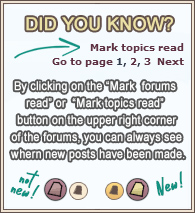
- The little conversation bubbles are cute, but make it look cluttered and are not classy. They are also bright yellow, which clashes with the red. Making it worse, the designs on the books seem to have little to do with what each forum is for. Replacing them with a little matching filigree endcap would be much prettier and look less cluttered.
 (0)
(0)  (0)
(0)
